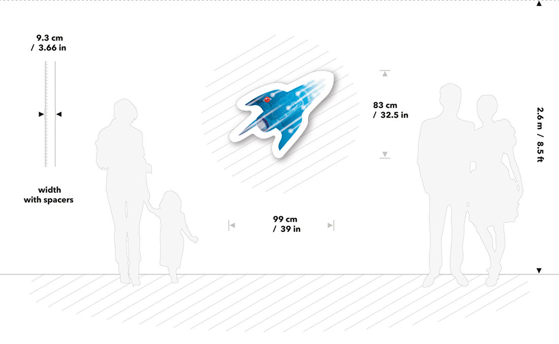
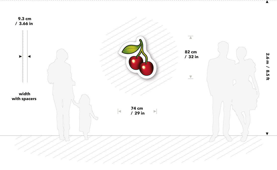
In graphic design whitespace is considered to be an active
design element to create a balance layout a page.
The same goes for your interior.
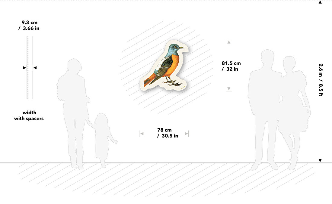
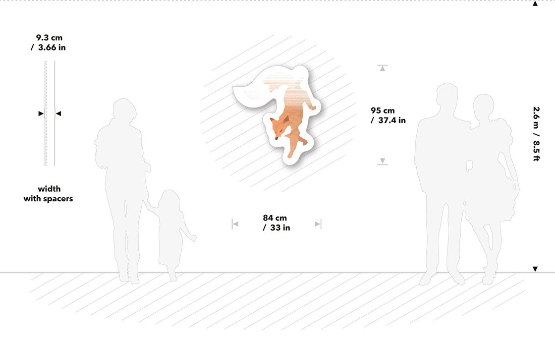
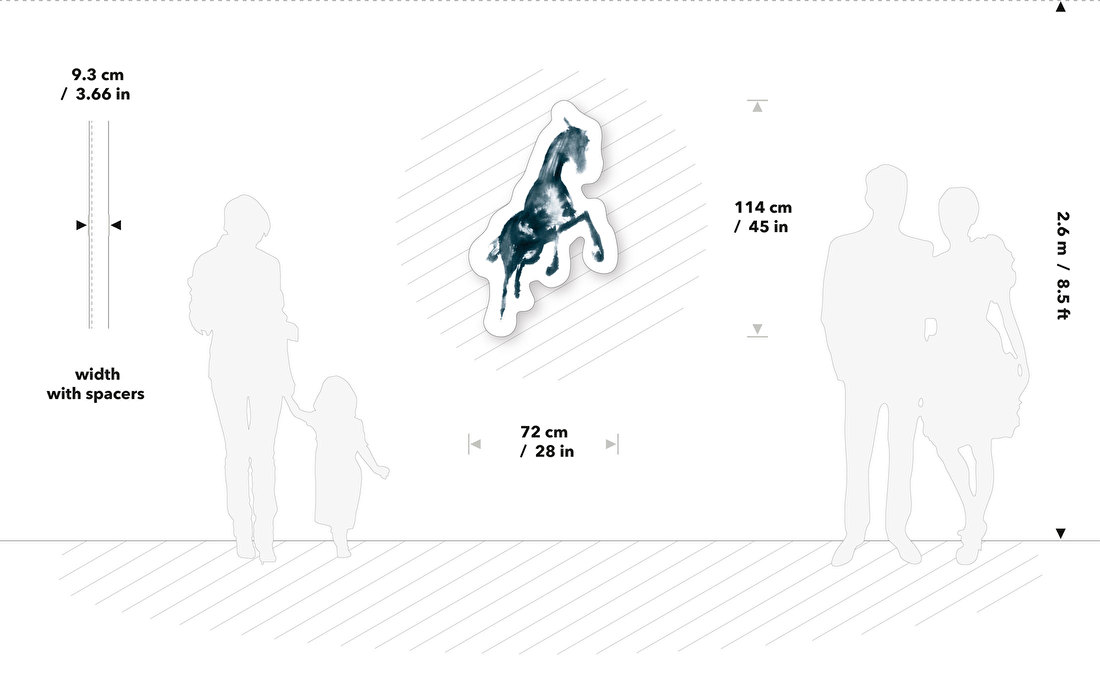
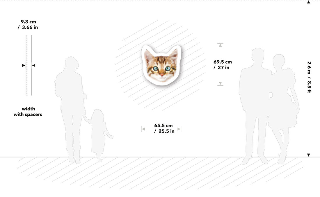
With your decorative graphic from the Syrup Pond now your wall becomes
the spatial white (colored, or brick) to balance with.
Although there is no guideline for the best position, we suggest to keep enough distance
to other interior objects for best graphical interior experience.
SCROLL DOWN
